Before we start creating presentations, there are presentation skills we need to know and understand. They include the basic principles of PowerPoint presentations and understanding the different types of presentations.
Adequate knowledge and use of these skills will enhance our presentation skills and make for effective delivery. Remember that PowerPoint is all about presentations; hence, you need to be equipped to ensure professional delivery at all times.
In this tutorial, you will learn the following:
- Basic principles of a PowerPoint presentation
- Types of presentations
The essence of this tutorial is to equip you with valuable skills that will make you capture the attention of your audience with your presentations.
Basic Principles of PowerPoint Presentation
You can make your presentations online, in a board meeting, or through any available medium. The essence of PowerPoint is to help you highlight some points to drive home your topic.
Because PowerPoint is not a Word document or Excel worksheet, some principles should guide your design.
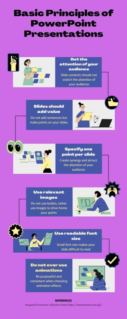
Get the attention of the audience
The most important principle is to ensure that the slides do not snatch the attention of the audience. I’ve been in places where people make presentations with PowerPoint. And over and over, I’ve seen myself concentrate on reading the content of the slides rather than listening. I believe that it happens to others too.
The first principle is to draw the attention of the audience towards you. So, you need to create slides that do not draw the audience’s attention but put concentration on the presenter.
At this, the audience can glance at the slides, but concentrate on the detail you provide. When this happens your audience will see your professionalism and expertise on the subject of discussion.
Let your slides add value to your presentation
As a follow-up to principle one, do not create slides with multiple sentences. There should be zero sentences in your slides. Rather, your slides should have points that add value to your presentation.
Also, I have seen people read from their slides during presentations, but this is unprofessional. When creating slides, do not add sentences, rather add points that will support your presentations.

For example, the above slide was adopted from a pitch I designed for Emhomarachi Farms. You can notice that the points support the presentation. If the audience dwells on the slide, they will get less value. Compare the above slide with the one below. Which one grabs the attention of the presenter rather than the presentation?

Your slides should support your points, rather than determine your points. When they are short and focussed, you can concentrate on your presentation rather than the slides.
Make one point per slide
Where necessary, it will be more profitable to make one point per slide in your presentations. This third principle depends on the length and timing of your presentation.
However, the number of slides does not increase the length of time, but your delivery.
I believe that making one point per slide will create synergy and attract the attention of the audience. This is because the audience will be eager to hear what you will say next.
Also, it will make the audience understand you and the topic better. When you clutter points in one slide, you have given the audience a clue of what next to say.
Use images where necessary
The fourth principle adds value to the third principle. Because you are using one point per slide, it makes sense to add relevant images.
Well-prepared presentations do not need to have bullets. Understand that bullets are used to list points as used above. But when a point is made per slide, the use of bullets is eliminated. In this case, the image becomes necessary to evoke emotion and create clarity among the audience.
As an example, take a look at the above slide redesigned to make one point per slide. Which one of them do you think is better?

With the above, you made your points with few words while keeping the presentation as simple as possible.
Font size should be readable
I have seen slides with tiny characters, making it difficult for the audience to read. Indeed, your audience should not dwell on your slides but focus on you. Using a tiny font size will increase this tendency. This is because they will struggle to see what is on the screen rather than pick the points and focus.
One of the reasons for using smaller fonts is when the slide is cluttered with lots of information. Although there are exemptions to this. In places where you are describing a diagram, all the required info will be contained in the slide.
Outside this scenario, always use larger fonts to enhance reading. As a rule of thumb, font 32 is ideal for your headings and font 24 for your points. Anything between 12 and 14 will strain the eyes of your audience.
Use fewer animations
Animation effects are wonderful additions to PowerPoint, but they should not be abused. When creating a presentation use it only when necessary. For example, you can use the Darken emphasis animation effect to show points already discussed.
Also, when choosing animation effects, try to be consistent throughout your presentation. Do not use the Darken effect on some slides and the Underline effect on other slides. It will make your presentation unprofessional and messy.
Fonts, colors, and whitespaces are important
The type of font used in a presentation is crucial. Do not use fanciful fonts that are difficult to read. Remember that the slides should not grab the attention of your audience.
When choosing colors, choose colors that resonate. It will be professional to assign colors to the different elements of your presentation and be consistent throughout the presentation. Do not use red on some slide headings and blue on others. This will make it easier to draw a connection with your audience.

Also, do not use the wrong color combination. For example, red on a red background, etc. It makes it difficult to read through your slides.
In graphics design, whitespaces are important, this same with a presentation. It helps to isolate points and make your presentations clearer to the audience. If you jam-pack your slides with information without proving spaces, it will make it look clumsy. So always separate your points, graphics, and images with whitespaces.
The audience attention is golden
To get the attention of the audience and sustain it, you need to be creative. During your presentation, keep them on track with stories that will grab their attention.
Also, try and make your presentations interactive such that the audience can participate. If it is all about you, be rest assured that your presentations will be boring, and you’ll fall out of favor.
The above principles should guide you when creating different types of presentations. As a follow-up, let us look at the types of presentations you may create in your workplace or for clients.
Types of Presentations
As a PowerPoint user, you need to understand the different types of presentations. This will help you add professional touches when creating any of them. Using the principles as a guide, try to understand which principle comes to play based on the type of presentation.

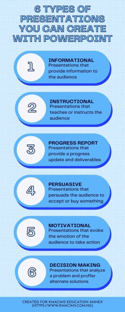
There are six (6) different types of presentations you can create. They include:
- Presentations that provide information
- Presentations to teach and instruct the audience
- Presentations that shows progress report
- Presentations that persuade the audience to take action
- Presentations that motivates the audience
- Presentations that enables the audience to make a decision
What are these types of presentations and how would you create them?
Presentations that provide information
This type of presentation is simply informational. It provides the audience with detailed information about a product, business, project, process, etc. It is a way of educating the audience on the features and benefits of the object of presentation.
When creating this type of presentation, you need to be concise and straight to the point. If you are discussing the features of a product, an image will be relevant. Your goal is to deliver the most important information that benefits your audience.
Presentations that teach and instruct
This is an educational presentation that enables your audience to learn a topic or subject. Though it is similar to informational presentations, it adds illustrations to buttress the facts.
For example, if your business creates a new app that schedules a meeting. You will need to teach your audience how to use the app. Such a presentation will have lots of images and action points.
In a workplace, seminars, workshops, and training are organized to teach new intakes or new skills. These are typical examples of instructional presentations.
When designing such presentations have the understanding of the audience in mind. Also, include steps or processes that will help the audience learn the topic or subject. Remember to include relevant images where necessary.
Presentations that report
A report type of presentation is usually designed to show the progress of a team, process, or deliverables. In an organization that has different teams’ in-charge of different operations, progress reports are invaluable.
Take, for example, the marketing team, new product development team, research, and development team, etc. There is a need for each of these teams to report the progress made towards reaching their proposed targets.
Each team will state their goals, accomplishments, problems encountered, and what should be done to meet targets. This type of presentation cannot be created without facts and figures that represent the progress made.
So, when creating such types of presentations, anticipate the questions your audience will ask and tackle them. Ensure that necessary charts and tables are constructed to show progress at a glance. Discuss goals and targets, progress, milestones and timelines, difficulties, and deadlines.
Presentations that persuade the audience
This type of presentation is marketing in nature. In this case, you are appealing to the audience to accept you or your product and probably make a purchase.
For example, an elevation pitch that tries to sell your business to an investor for funding. Similarly, a sales proposal is an attempt to convince someone to buy your product.
Persuasive presentations focus on problems and solutions. It tries to tell the audience the available solutions to their problems.
When designing such presentations, your tone should be active and convincing with facts and figures, You should not sound begging but exhibit mastery and expertise. Where necessary, use images to back up your facts.
Presentations that motivates the audience
This type of presentation draws the attention of the audience and inspires them to take action. It can equally convince them to act in a certain way. I usually watch TED Talks over the television, and I admire how presenters motivate you to take action.
In such presentations, images and words are combined to evoke the emotions of the audience. For example, using the story of successful individuals to encourage hard work.
When creating such presentations, choice of words and images matter because your goal is to motivate not to inform. You also need real-life stories of successful people. Facts and statistics are not necessary for this type of presentation.
Presentations that trigger decision making
The idea of decision-making rests on the pivot of problems and solutions. In this type of presentation, you are required to present various solution alternatives to a problem.
Diagrams, graphs, and figures may be used to compare the different solutions offered. A critical look at the figures or graphs provided should enhance the decision-making of the audience.
When creating such presentations, a graph or comparison table is necessary. This will help the audience make an informed decision.
Conclusion
Principles of PowerPoint presentations and types of presentations are invaluable skills that PowerPoint users must acquire. Their knowledge will give you an edge over other PowerPoint users without such skills. This is because you will be equipped to create professional presentations at all times.
Principles of PowerPoint presentations are guides that will help you produce well-structured presentations that resonate with your audience. The knowledge of types of presentations will help you to understand the tone, choice of words, and kind of images to include in a presentation. As we continue with PowerPoint presentations, do not neglect any of these two skills. If this tutorial helps you, share it with friends and colleagues.


