The grid layout gave us a better way to create a responsive website. The flexbox layout is great but it has its limitations. In flexbox, items are laid out in one dimension.
In a grid layout, items are laid in two dimensions. The grid layout permits items to be laid out in columns and rows. It also gives room for space in between, called gutters.
In this module, we shall discuss:
- the grid system,
- how to create a grid layout,
- using functions in a grid layout,
- the grid lines, and item placement,
- the grid-area, and
- grid-template-area.
The grid system
The grid system is used to create a multi-dimensional and responsive website. To create a grid layout, we use the CSS declaration:
display: grid;
OR
display: inline-grid;
on the parent container.
Just like the flexbox, the grid layout will consist of the parent element and at least one child element.
When the display value of grid is applied on a parent container, all the direct descendants or children of that element becomes grid items.
But, unlike the flexbox, when the display property value becomes grid, the container becomes a grid layout with one column and row.
The direct descendants are not immediately transformed into a grid layout like the flexbox. They require that columns and rows be created for a complete grid layout.
Creating the grid layout
To create a grid layout, we do the following:
- First, apply a display property value of grid to the parent container.
e.g. article{ display: grid}.
- Define the number and size of the columns in the grid layout.
e.g. article{grid-template-columns: 250px 250px 250px 250px}
In the above, we defined 4 columns with a size (width) of 250px per column. You can also use auto and/or percentage (%) values to define the grid-template-columns.
Another important value to be used for grid-template-columns property is the fraction ‘fr’ unit. This unit is used to distribute available space into equal parts according to the specified value.
For example, if we use;
grid-template-columns: 1fr 2fr 1fr
It means to give one fraction of the space available each to columns 1 and 3 and 2 fractions to column 2. Hence, column 2 will be 2 times column 1 and 3.
- Next, use the grid-template-rows to define the height of each row in the grid container. For a container with one row you can use:
grid-template-rows: 200px;
For a container with two rows, you can use
grid-template-rows: 200px 300px;
- Finally, use the grid-gap property or just gap (not supported by all browsers) to specify the gap between the columns and the rows.
You may specify the row gap only with grid-row-gap (row-gap) and column gap with grid-column-gap (column-gap).
Example:
Lets’ look at an example embracing the above four properties:
Using functions in a grid layout
We shall discuss two functions that will be of importance when creating a grid layout. They are: the minmax() function and the repeat() function.
The minmax() function
When a grid layout is created, the content grows within the grid items automatically. But when we explicitly specify the row height (grid-template-row: 150px), the content may grow to overflow its size.
To avoid this, we may use the minmax() function to ensure that a minimum height is specified, while allowing space for the growth of content. We can be used with the grid-auto-row property to ensure that all rows height are assigned at the same time.
The repeat() function
The repeat() function is used to specify the number of times a column will be repeated. Including the size (width) of each column.
The function is used alongside the grid-template-columns as shown below:
Grid-template-columns: repeat(x, y)
where x = number of times to repeat a column and
y = size of columns to be repeated. y could be a single value or multiple values.
Example:
The above repeat() function states that 2 columns of sizes 1fr, 2fr should be created and be repeated twice in a row.
The first value of 2 indicates how many times the column created should be repeated. The second value specifies the size of the columns to be created.
The gridlines and item placement
The grid items in a grid container are arranged in column lines and row lines. Column lines are arranged from left to the right while row lines are arranged from top to the bottom.
The leftmost line is column line 1 till the rightmost line, while the topmost line is row line 1 till the bottom line, as shown below.
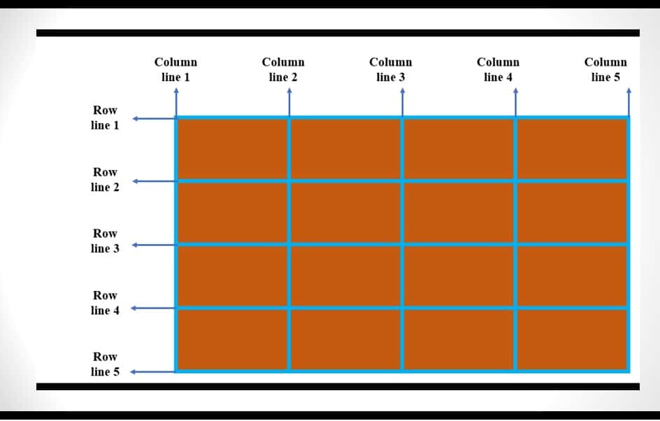
The line numbers displayed above help us to place contents in grid items. The line numbers are used to provide values for the following properties: grid-column and grid-row.
- grid–column: This property is used as a shorthand for grid-column-start and grid-column-end. The grid-column-start property is used to indicate where the grid-column started while the grid-column-end property is used to indicate where the grid-column
Therefore line numbers are used to determine the values of the grid-column and grid-row properties.
For Example, you can use:
grid-column-start: 1
grid-column-end: 3
OR
grid-column: grid-column-start / grid-column-end
written thus:
grid-column: 1/ 3
This means that the column begins at line 1 and ends at line 3. This will span 2 columns.
If you want only column 3 you may simply use 3 instead of 3/4.
- grid-row: This property is used as a shorthand for grid-row-start and grid-row-end. The grid-row-start property is used to indicate where the grid-row started while the grid-row-end property is used to indicate where the grid-row We can write it as follow:
grid-row-start: 2
grid-row-end: 5
OR
grid-row: grid-row-start / grid-row-end
Written as:
grid-row: 2 / 5
This means that the row begins at line 2 and ends at line 5. This will span 3 rows.
If you want only row 2 you may simply use 2 instead of 2 / 3.
What these imply is that to create a good layout, you may need to draw row and column lines. This will help you understand how to place your items in the grid.
Let us illustrate with the following.
Let’s create a grid layout with 7 column and row lines. That is 6 columns and 6 rows.
We can create our column layout by sharing them equally thus [repeat(2,1fr 1fr 1fr)]. This means that all the columns have equal size.
Let us now place items in this container using our HTML and CSS. We will add class to our block elements.
The final CSS and HTML will look like this. Please, take your time and go through the code to understand it better. Ask question where you are confused.
The grid-area and the grid-template-area
grid-area: The grid-area property can be used as a shortcut for the grid-row-start, grid-column-start, grid-row-end, and grid-column-end.
Let us illustrate with the HTML above.
grid-template-area: I believe you have understood how we use the grid-area property. Let us discuss the grid-template-area property.
In the grid-template area, instead of using line numbers to define the area cells will span, we use names.
The use of names to define grid-area is called grid-template-areas.
How does it work?
- First, we’ll define our grid container, say:
article{display: grid;}
- Second, we specify our columns. Remember, this depends on the layout you want for your website. Let’s assume a website with main content in the middle and two sidebars, one at the left and the other at the right.
Then we have:
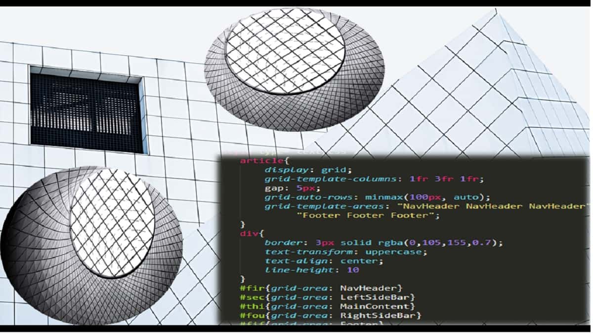
grid-template-columns: 1fr 3fr 1fr; gap: 5px;
The above column definition has 3 columns with the middle column being 3 times the size of the first and the last columns.
Let us assume that we want a site layout that looks like this:
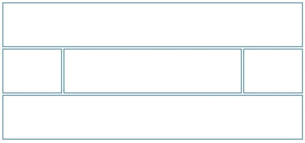
In the above layout, we will use the top row as the header row, the middle row will be the main content with two sidebars and the last row will be the footer.
- Define the grid-template-areas as follow:
grid-template-areas: "NavHeader NavHeader NavHeader" "LeftSideBar MainContent RightSideBar" "Footer Footer Footer";
Notice that each row is defined in three columns within double quotation as follow:
- “NavHeader NavHeader NavHeader” indicates that the NavHeader will occupy the entire row.
- “LeftSideBar MainContent RightSideBar” indicates a left sidebar, main content and right sidebar.
- Finally, we define the content cells individually.
When we combine the whole code, we have as follow:
When using the grid-template-areas, all cells of the grid container must be filled. If there is a need for a cell to be empty, use the “.” (full stop) to indicate such cell(s). Do not for any reason repeat an area in different locations (areas are unique in the grid layout).
Assignment: Create a web layout using a 12-column grid system
Conclusion
Frameworks that use the grid system usually use 12 columns or 16 columns grid system. Bootstrap, Zurb Foundation, etc use 12 columns while Titan and 960 Grid System use both 12 and 16 columns.
If you are using a 12 column grid system, then you will have 13 column lines.
So far, we have learned how we can alter the default flow of HTML elements using CSS. You can layout your website in a table, but this is not recommended.
If you wish, you can use float to layout your website. This requires the knowledge of @media at-rule to make your website responsive. We will cover this aspect in our next course “Building Responsive Website.”
The flexbox and grid layouts are responsive by default, but the grid layout win. However, you will need browsers that support HTML5 to use this layout for your pages. The good news is that major browsers support HTML5.
From what we have learned so far, you can be able to create an appropriate layout for your website.

