We took quite a considerable amount of time to discuss two display property values which include flex and grid. We also learned of their importance in creating flexible and responsive web layouts.
In this course, we will look at how to ensure that our website is suitable for all kinds of devices. We will take time to look at how to design a responsive web layout using @media rule.
In recent times, people connect to the internet with different kinds of devices, including phones, watches, tablets, etc. It is important that you make your website display appropriately in all these devices.
A website is described as responsive if it could automatically adjust its content for optimal viewing in all devices. In this case, the size of the device used to access it would not be a barrier.
Hence, it does not matter what the size of the device used in accessing the website.
How do I know my website is responsive?
People connect to the internet with different devices. This reason implores us to test and see how our website displays on different devices. Our experience in this testing tells us how others feel when they access our site.
There are different ways to carry out this test. Let’s look at 3 of them.
Resizing the browser
The easiest way to test a website for responsiveness is to resize the browser window to different sizes to match different viewports.

Tablet Mode after Adjusting the Browser a Little

When doing this, we observe if there are rendering problems, and correct them at once.
Test in Different Mobile Phones
Though the browser resizing method helps, it will be better to test the site on real devices. You can use different mobile devices where you can perform different tasks.


I advise that you test your site using friend’s and family’s devices and see how your site renders on their devices. Also, perform different tasks and note how people who browse your site feel.
There is yet another method.
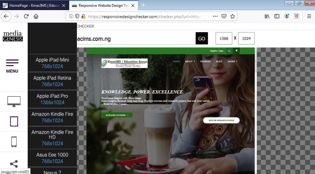
Use appropriate testing URL
These days, it’s easy to test your website for responsiveness. There are different websites that can help you do this, some of them include:
- Responsive Website Design Tester
- Screenfly | Test your Website at Different Screen resolutions
- Am I Responsive?
- Responsinator
- Responsive Device Testing
- Is Responsive
- First, visit any of the websites above;
- Enter the URL of your website.

- Test using different viewports.

Among these 3 methods, it will be best to test your sites using real devices. Do not rely on only the first and last methods.
Welcome to the last of the 3-course series in CSS (Cascading Stylesheets). In this course, we will discuss the following:
- how to work with generic and web fonts
- how to add animations to elements, and
- how to create responsive websites (web layouts)
Let’s get running, I can’t wait to start.
Responsive Web Layout using @Media Rule
As defined at the beginning of this course, a website is responsive if it adjusts perfectly to any device used to access it.
Remember that the flex, multiple columns and grid properties make building a responsive website easier these days. This is because they are responsive by default.
However, when using floats, and when we want to create breakpoints for different devices in our layout, we use the @media at-rule to make a website responsive.
Hence, we can wave flexbox and grid layouts and still create a responsive web layout using @media ruleset.
The viewport
The viewport is your screen size or the size of your browsing window. Viewport depends on the screen size of a device. Different devices have different screen sizes. Mobile phones have smaller screen sizes or viewport while laptops and desktops have larger viewports.
Viewports can be basically divided into 3:
- mobile phones (max-width: 768px)
- tablets and netbooks (max-width: 1024px)
- laptops and desktops (min-width: 1024px)
Traditionally, the iPhone and iPad view ports are used where:
iPhone has (min-width: 320px; orientation: portrait) and (max-width: 480px; orientation: landscape).
iPad has (min-width: 768px; orientation: portrait) and (max-width: 1024px; orientation: landscape).
Because devices have different viewports, it is important for us to ensure that our website adjusts to users’ viewport to create a good user experience.
For us to achieve this, we need to include a <meta> element in the <head> section of our HTML document with the name and content attributes as follow:
<meta name = “viewport” content = “width=device-width, initial-scale=1.0”>
The above code will tell the browser how to adjust the webpages depending on the user’s device-width.
Haven understood the basics; we shall begin our journey towards building a responsive web layout using @media ruleset. We shall bring the detail of @media rule in our next post.


