Excel PivotTables are a versatile feature that allows users to summarize and analyze large datasets, providing insights into patterns and trends.
They enable the reorganization of data, which can reveal relationships and dependencies that might not be apparent from the raw data itself.
With PivotTables, you can quickly calculate, sort, and filter to customize the data view, making it an essential tool for data analysis.
As a freelancer, efficiently managing your time and resources across multiple projects and tasks is crucial for success. Excel PivotTables offers a powerful solution to this challenge, allowing you to:
- Visualize your workload across different projects – Excel PivotTables are a powerful tool for freelancers to manage and analyze their workload effectively.
- Identify over-allocated or underutilized time slots – By summarizing data from various projects, PivotTables allows freelancers to visualize their workload, making it easier to spot over-allocated or underutilized time slots.
- Make data-driven decisions about taking on new projects – This visualization aids in making informed decisions about taking on new projects, ensuring that there is a balanced distribution of effort across different clients and project types.
- Ensure balanced effort across clients and project types – PivotTables can help track time spent on tasks, analyze income across projects, and manage expenses, which are crucial for maintaining a successful freelance business.
If you are a freelancer or project manager, your most expensive resource is time, and this is in limited supply. Despite your tools and expertise which you can upgrade depending on your projects’ needs, you cannot upgrade time.
So, you’ll need to allocate your limited resources to the number of projects and tasks seeking your daily attention to meet client’s deadline. You can allocate time in two ways:
- On a daily basis, utilizing a 24-hour daily time allocation. Here, you allocate several hours each day for each project as needed.
- Project total time, which sums the total hours it will take to complete a project. In this strategy, you’ll add the total number of hours it’ll take to complete a project or task.
Whichever timing strategy you want to use, be consistent.
In this guide, I’ll walk you through creating a dynamic resource allocation system using Excel PivotTables; including interactive filters for easy analysis.
If you are new to PivotTables, update your knowledge using this resource: How to use PivotTable in Excel 2016.
Setting Up Your Resource Allocation Spreadsheet
With a working knowledge of PivotTables and their uses, we can walk you through how to use Excel PivotTables for efficient resource allocation.
Before we dive into PivotTables, let’s create a robust dataset to work with:
- Open a new Excel workbook and name the first sheet “ProjectData”
- Create the following columns:
- Date
- Project Name
- Client
- Task Type
- Hours Spent
- Billable (Yes/No)
- Hourly Rate
- Enter sample data for at least 3-4 projects spanning 2-3 months. Ensure variety in task types, billable hours, and clients.
Example data:
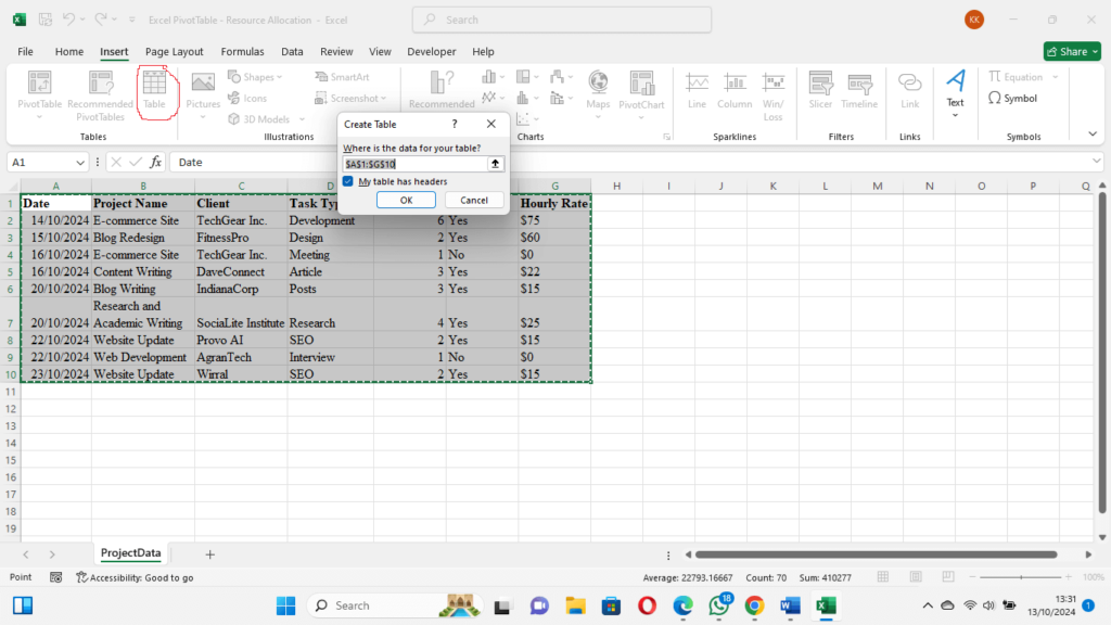
| Date | Project Name | Client | Task Type | Hours Spent | Billable | Hourly Rate |
| 15/10/2024 | E-commerce Site | TechGear Inc. | Development | 6 | Yes | $75 |
| 15/10/2024 | Blog Redesign | FitnessPro | Design | 2 | Yes | $60 |
| 16/10/2024 | E-commerce Site | TechGear Inc. | Meeting | 1 | No | $0 |
| 16/10/2024 | Content Writing | DaveConnect | Article | 3 | Yes | $22 |
| 20/10/2024 | Blog Writing | IndianaCorp | Posts | 3 | Yes | $15 |
| 20/10/2024 | Research and Academic Writing | SociaLite Institute | Research | 4 | Yes | $25 |
| 22/10/2024 | Website Update | Provo AI | SEO | 2 | Yes | $15 |
| 22/10/2024 | Web Development | AgranTech | Interview | 1 | No | $0 |
| 23/10/2024 | Website Update | Wirral | SEO | 2 | Yes | $15 |
You can continue adding rows to create a comprehensive dataset. Your dataset can span up to 3 months or more depending on how long you are working on a task or project. I use a daily timing strategy.
Creating Dynamic PivotTables for Project Analysis
Now that we have our data, let’s create insightful PivotTables:
- Select your entire dataset (You may use Ctrl + A).
- Go to the Insert tab, under Tables, select Table. [Create a table for your dataset. This will help you to add more data belonging to this table in the future]
- In the “Create Table” dialog box, click OK.
- In the Table Design tab, under Properties, change the table name, e.g. ‘FreeDataset’.

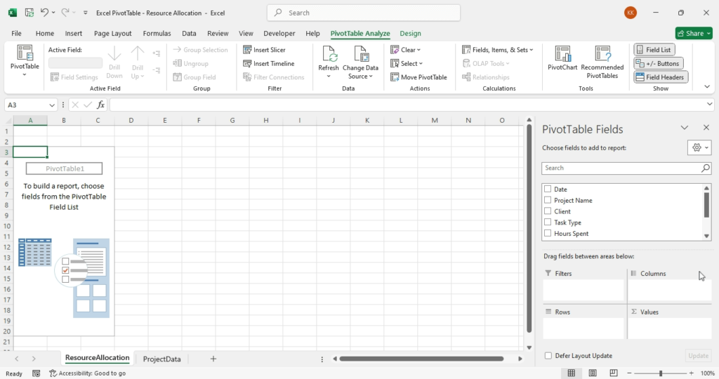
- Go to the Insert tab again, under Tables, select PivotTable.
- Choose to place the PivotTable in a new worksheet

- Name the new sheet “ResourceAllocation”. This is what your worksheet should look like.

With the above steps accomplished, let’s create our first PivotTable:
- In the PivotTable Fields pane:
- Drag “Project Name” to Rows
- Drag “Date” to Columns
- Drag “Hours Spent” to Values
- In the Values field, ensure that the summarize values option is set to SUM. This should be the default.
- To check this, click on ’Hours Spent’ and select “Value Field Settings” In the Value Field Setting dialog box ensure that the Sum option is selected.
You now have a table showing the total hours spent per project per day. Let’s enhance it:
- Right-click on any date in the Columns area
- Select “Group” from the popup menu, and Months in the dialog box to summarize data by months.
- In the PivotTable Fields pane, drag “Client” above “Project Name” in the Rows area
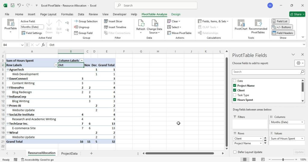
Your PivotTable now shows a hierarchical view of hours spent per client and project, broken down by months.
Try adding more projects in different months or change some dates to have up to 2-month data. Your sheet should look like this:

Implementing Interactive Slicers for Effortless Data Filtering
Interactive slicers in Excel are a powerful feature for freelancers who need to analyze and present data efficiently.
By implementing slicers, freelancers can create dynamic reports and dashboards that allow clients to filter and sort through data with ease.
This functionality is particularly useful when dealing with large datasets, as it provides a quick way to drill down to the specifics without altering the underlying data.
With the ability to connect slicers to multiple pivot tables, freelancers can offer a seamless data exploration experience, enhancing their service offering and enabling better data-driven decisions.
Let’s add slicers to our Pivot Table. This section will guide you through a step-by-step process that you can apply to a large dataset.
- With your PivotTable selected, go to PivotTable Analyze, under Filter, select Insert Slicer.
- On the Insert Slicer dialog box, select “Task Type” and “Billable” as slicer fields and press OK.
- Arrange the slicers above your PivotTable for easy access
Now you can click on the slicer buttons to instantly filter your data. For example, click “Development” in the Task Type slicer to see only development-related hours.
Let’s add one more PivotTable for financial insights:
- Copy your existing PivotTable and paste it below the first one
- In the Values field, add “Hourly Rate”
- Click the “Sum of Hourly Rate” field and select Value Field Settings from the list.
- Change the “Summarize value field by” option to “Average”
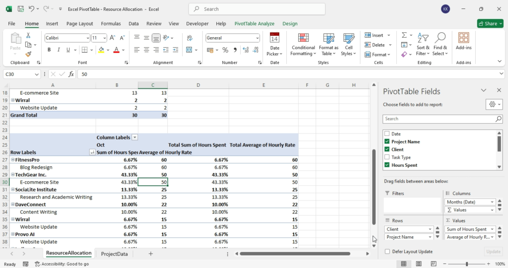
- In the “Show Values As” tab, select “% of Grand Total” and click OK. Your pivotable should look like this:

This new Pivot Table shows the percentage of time spent on each project and the average hourly rate per project.
The next section will apply our pivot table to the real world.
Case Study: Web Developer’s Multi-Project Dashboard
Let’s put our PivotTables to work in a real-world scenario. Dozie is a freelance web developer and content creator juggling multiple projects such as:
- E-commerce site for TechGear Inc.
- Blog redesign for FitnessPro
- Content writing for DaveConnect
- Blog post writing for IndianaCorp, etc
Dozie aims to balance time effectively across these projects while maximizing billable hours. Therefore, using our PivotTables, Dozie can:
- Identify time allocation for the different projects:
- The first PivotTable shows that the e-commerce site is taking up 43% of total hours
- The research and content writing were 13% and 10% respectively.
- The web development interview with AgranTech takes 3% of the total allotted time.
- Analyze billable vs. non-billable time:
- Using the “Billable” slicer, Dozie sees that there are 2 non-billable tasks that took 2 hours of the total time allotment.
- The first is a meeting with a client which is important. The second is an interview to secure a project by AgranTech.
- The second might be skipped to meet with other obligations. But, because the allotted time is only 3%, and looking at the expected hourly pay, Dozie decides to accommodate the time.
- Evaluate project profitability:
- The second PivotTable reveals that while the e-commerce project takes up 43% of the time, its average earning is $50.
- Similarly, blog redesign with an average earning of $60 takes up only 7% of the entire allotted time.[1]
Based on this analysis, Dozie decides to:
- Allocate more time to the higher-paying blog redesign project
- Reduce time spent on blog and content writing.
- Finally, propose a rate increase for the blog post project.
Advanced Tips and Tricks for Freelance Resource Management
- Calculated Fields: Add a calculated field to your PivotTable to show potential earnings. Follow these steps:
- Go to PivotTable Analyze tab, in the Calculations group, select Fields, Items, & Sets and select Calculated Field from the list.
- In the Name box enter “Potential Earnings”
- In the Formula box enter =Hours Spent*Hourly Rate
- This will create a calculated column displaying each projects potential earning.
- Conditional Formatting: You may apply conditional formatting to your PivotTable to highlight overallocated days:
- Select your “Sum of Hours” column
- On the Home tab, in the “Styles group”, select Conditional Formatting, then select Color Scales.
- From the list, choose a color scale of your choice.
- PivotCharts: You can also create a visual representation of your data using pivot chart as follow:
- Select your PivotTable
- On the PivotTable Analyze tab, under Tools group, select PivotChart.
- Choose a chart to show project distribution over time.
- Data Validation: Ensure data integrity by setting up data validation rules in your source data:
- In your source table, select the “Billable” column
- Go to Data > Data Validation
- In the dialog box, under Allow select List
- In the Source box, enter: Yes, No and click OK.
By implementing these advanced techniques, you’ll have a robust, flexible system for managing your freelance workload efficiently.
Remember to regularly update your data and refresh your PivotTables to maintain an accurate view of your resource allocation. With practice, you’ll be able to make informed decisions about project commitments, pricing, and time management, ultimately boosting your freelance career success.
Conclusion
In conclusion, Excel PivotTables are an indispensable tool for freelancers managing multiple projects.
They offer a dynamic way to analyze large datasets and extract meaningful insights without spending hours on data processing.
Embrace the power of PivotTables to streamline your workflow, make informed decisions, and maximize your productivity.
Start transforming your data into actionable intelligence today and see the difference it makes in your freelance journey!
It’s now your turn to submit your PivotTable template in the comment box.
[1] Understand that the time allotted to a project depends on its complexity and technical requirements. This analysis should help you know the projects to pay more attention to depending on your priority.


